This weekend I migrated this blog from WordPress (with a static generator) to using Hexo directly. Overall I’m pleased and the learning curve isn’t bad, though why I can’t easily link to pages or taxonomy items is puzzling. One challenge that was relatively easy to resolve was this one: how to add movie posters to the top of movie review articles?
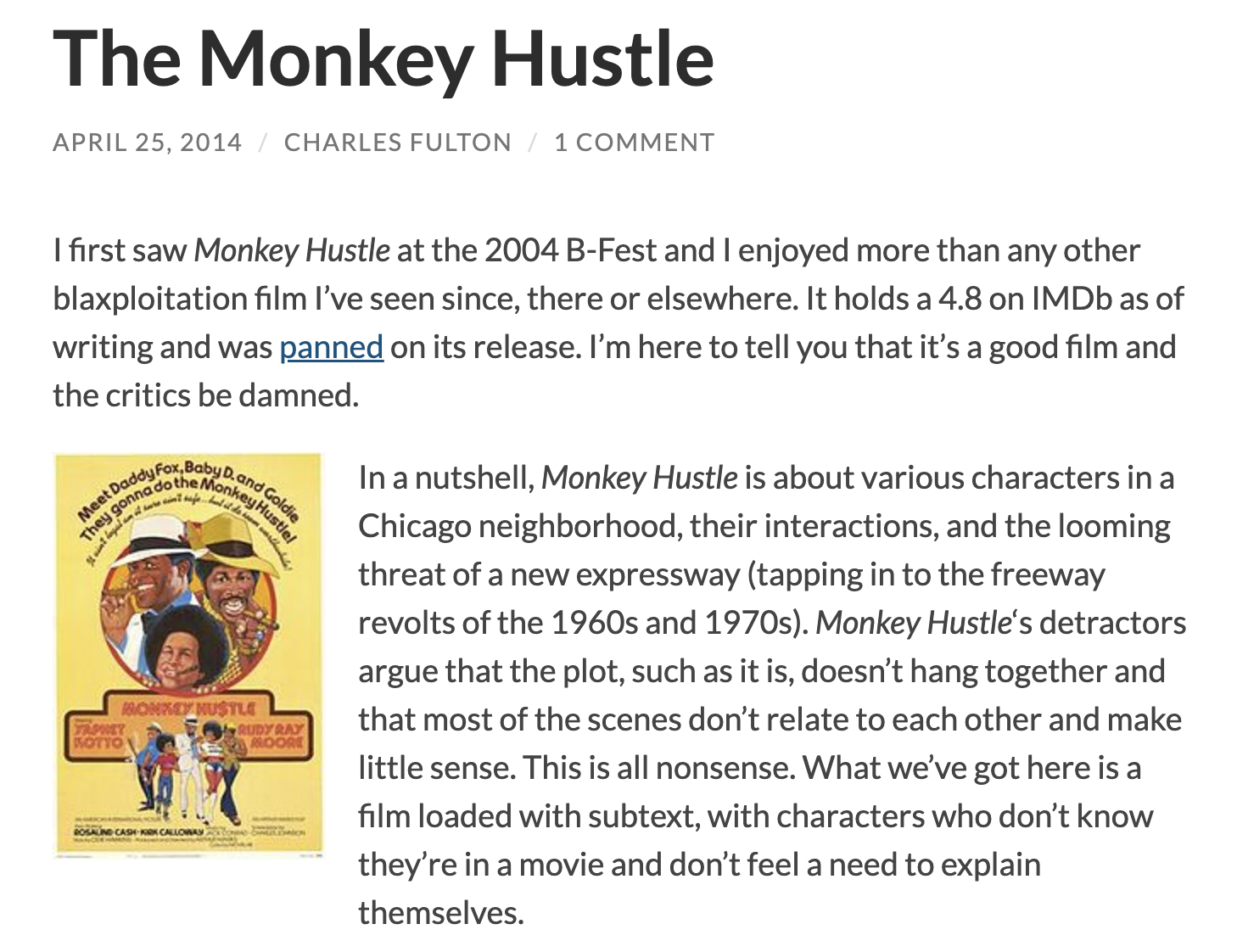
I haven’t written a movie review here in a while, and I haven’t decided whether to start again or go longer form on Letterboxd. I’m proud of the writing of the dozen I did back in 2013-2014. I never wrote long enough to justify a billion screencaps (à la Ken Begg), but I did like including the poster at the top, floated left:

Markdown doesn’t support image alignment. You can inject custom HTML, but I’m trying to keep things simple. The solution I chose is to modify the theme to support custom front matter.
Theme modification
First things first, I needed a good copy of the theme (landscape in my case) to customize. I had it installed via npm in node_modules/hexo-theme-landscape, so I cloned from source into themes/landscape. I then placed this snippet in layout/_partial/article.ejs, at the beginning of the article body:
1 | <% if (post.poster) { %> |
If the post has a poster property, it will place the image, with markup, at the top of the article. I then added the bare minimum of CSS to float it left and keep the width consistent:
1 | .poster |
Now, when writing a post, I only need to add the relative path of the poster to the front matter:
1 |
|
The post now renders much as the WordPress posts did, with the image floated left. This could be extended further to include captions and alternative text.